UPular by Pogo.
12.28.2009
12.20.2009
A Simpler Christmas
10.29.2009
9.30.2009
9.29.2009
Repacked for Teens

Edgy and irreverent.
Those were the orders from Hasbro on a re-packaging, re-positioning assignment for three of Hasbro's classic board games.
Pictionary, Trivial Persuit, and Taboo were canned to appeal to a younger demo with a bit more pocket change, but a shorter attention span in this hyper-digital-handheld-device-driven era we’re all traveling through.

We presented two themes with designs to match: Co-Ed Wrestle and Shock Talk. The games were miniaturized and made portable by using a squat can and decreasing the size of gameboards, pawns and whatnots.
Using found imagery and period appropriate typography, the cans take a spin in the mosh-pit of retail punkery with hopes kiddies and their mums are eager, or at least curious enough to slap down a few bucks for a little gameplay.
9.28.2009
9.24.2009
7.29.2009
Best Artist in the Universe

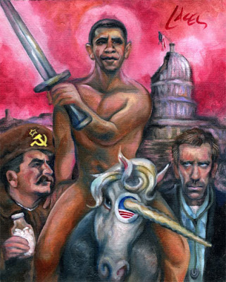
Barack Obama and Unicrons and Rush and rockets and House and... and... And so much more.
By Dan Lacey.
7.16.2009
An Eternally Brief Post


Another quick post to announce the selection of another logo I drafted to be included in the upcoming LogoLounge Master Library series
Above is a logo concept I did for Larry Barnes at Eternal Screen Printing in Bakersfield back in 2002. LogoLounge and Rockport Publishers will include it in the book, Animals, Birds and Mythology.
Below is the final logo Larry picked:

Eternally cool.
6.22.2009
A Cigar, Sweet Music & You


Less talk, more work.
This was done for Design Mark for the 17th Street Cigar Company in Bakersfield back in 2006.
That’s Marlin intern Jared Tomlinson.
6.18.2009
Sweet Sweet Icons

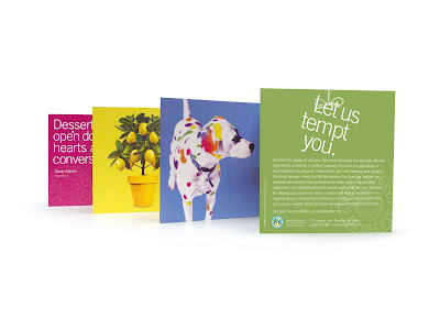
Sweet Street Desserts is venturing into the world of the consumer and as such, is ramping up their brand to appeal to the delicate sensibilities of the rabid American shopper.
Here at Marlin, working with senior copywriter, Judith Garson, we put together the above 7-panel consumer brochure to be included in every outbound online order from the amazing Sweet Street confections factory in Reading, Pennsylvania.
The idea was to take a series of Sweet Street’s products and create photo-realistic icons reflecting the essence of the dessert.
I'll put up the complete series of images in a future post.
6.09.2009
6.03.2009
Halogen


My pal Brian Williams, CD at Inspiration Networks, threw me a bone with an identity exploration for a documentary television network.
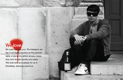
Halogen takes a faith-based approach to exploring real world issues without the all-too-common whitewashing or sappy storytelling many Christian programs trip over.
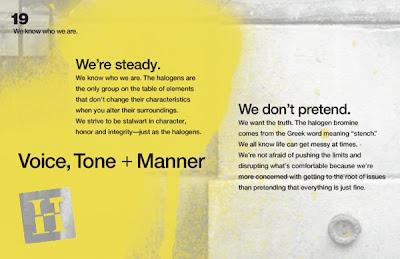
Up top are my favorite solutions to the problem. Below are sample pages for a Field Guide the network publishes to express the voice, tone and manner of the channel.
5.04.2009
LogoLounge Master Series

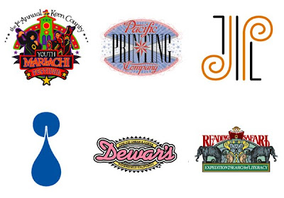
A quick post to announce the selection of 6 logos I drafted to be included in the upcoming LogoLounge Master Library series.
The Master Library is a bit of a twist on the popular LogoLounge book series focusing on singular topics of reference including:
• Initials & Crests
• Typography
• People
• Animals, Birds and Mythology
• Shapes and Symbols
• Nature and Food
• Arts and Culture (including transportation, sports and architecture)
Here’s my work which LogoLounge and Rockport Publishers will include in the first book, Initials & Crests:
1.07.2009
Separated at Birth

Is any idea really original? What’s old is new and what’s new is old?
I received an anonymous comment on my First Light post calling me to the carpet of unoriginality. The commenter pointed out a similar logo was created for another production company with a similar name and similar concept for an identity, Natural Light Films. Have I been called out?

The First Light Solution
Logo design, when it’s done well, seeks to create a visual play between the mark and the thing it represents. In my solution for First Light, I used a big door in the form of an ‘F’ revealing a crack of light for the movie production house. I wouldn’t say that a big ‘F’ by itself is compelling, nor is using light cascading from an open door original either. But the two together create an interesting representation of the specific nature of First Light:
“First Light can either be one of two things: 1. The big bang that brought you all to my blog, or 2. The first star a new telescope is trained upon. Either way, the metaphor is spot-on for what the production company is trying to do: Get young directors and writers funding to realize their digital movie making dreams.”
For a point of reference, and a look into the work done exploring the First Light problem, below are the options presented to the client:

The Natural Light Dimmer Switch
In the case of Natural Light the open door revealing a natural light source makes sense, but only in the literal form, and by itself, doesn’t create an ownable metaphor for the production company. On the Natural Light site there’s a brief statement outlining the mission of Natural Light:
“NATURAL LIGHT FILMS specializes in true to light documentary and television series production. We create programs that entertain, educate, motivate and involve each viewer as a participant in the lives and stories of each subject.”
So what do they mean by “True to Light?” I suppose it could be interpreted as presenting something as it is, or it could be faith-based. Whatever the reason, using an open door to represent the idea of “True to Light” simply isn’t unique. A quick search for ‘door’ and ‘light’ over at LogoLounge demonstrates the open door solution is a popular one:

What about my open door solution?
Clichés can be good, but most often they’re bad, occupying that place along the road where pedestrian design resides. Good logo design often employs clichés to build a familiar link between an audience and a company, but the best clichés are those with an unexpected or clever twist.
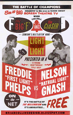
So, the bell has rung and the gloves have come off: The open door for Natural Light is a bit of a bore. It’s rendered well enough and it does make sense, but the ambitious contender simply sits in its corner hoping for another chance at the title. But really? With a glass jaw, and an open door to an alley littered with tired ideas, did the First Light logo ever have a shot, all the while lacking the heart of a champ?
Subscribe to:
Posts (Atom)
