
Is any idea really original? What’s old is new and what’s new is old?
I received an anonymous comment on my First Light post calling me to the carpet of unoriginality. The commenter pointed out a similar logo was created for another production company with a similar name and similar concept for an identity, Natural Light Films. Have I been called out?

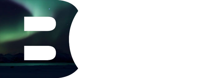
The First Light Solution
Logo design, when it’s done well, seeks to create a visual play between the mark and the thing it represents. In my solution for First Light, I used a big door in the form of an ‘F’ revealing a crack of light for the movie production house. I wouldn’t say that a big ‘F’ by itself is compelling, nor is using light cascading from an open door original either. But the two together create an interesting representation of the specific nature of First Light:
“First Light can either be one of two things: 1. The big bang that brought you all to my blog, or 2. The first star a new telescope is trained upon. Either way, the metaphor is spot-on for what the production company is trying to do: Get young directors and writers funding to realize their digital movie making dreams.”
For a point of reference, and a look into the work done exploring the First Light problem, below are the options presented to the client:
The Natural Light Dimmer Switch
In the case of Natural Light the open door revealing a natural light source makes sense, but only in the literal form, and by itself, doesn’t create an ownable metaphor for the production company. On the Natural Light site there’s a brief statement outlining the mission of Natural Light:
“NATURAL LIGHT FILMS specializes in true to light documentary and television series production. We create programs that entertain, educate, motivate and involve each viewer as a participant in the lives and stories of each subject.”
So what do they mean by “True to Light?” I suppose it could be interpreted as presenting something as it is, or it could be faith-based. Whatever the reason, using an open door to represent the idea of “True to Light” simply isn’t unique. A quick search for ‘door’ and ‘light’ over at LogoLounge demonstrates the open door solution is a popular one:
What about my open door solution?
Clichés can be good, but most often they’re bad, occupying that place along the road where pedestrian design resides. Good logo design often employs clichés to build a familiar link between an audience and a company, but the best clichés are those with an unexpected or clever twist.
So, the bell has rung and the gloves have come off: The open door for Natural Light is a bit of a bore. It’s rendered well enough and it does make sense, but the ambitious contender simply sits in its corner hoping for another chance at the title. But really? With a glass jaw, and an open door to an alley littered with tired ideas, did the First Light logo ever have a shot, all the while lacking the heart of a champ?

