7.26.2008

Faviconation


For quite some time, I have been fascinated with those little jewels up top in the URL address bar of our browsers to the cybernet. I think of them as a virtual lapel pin. Kind of like wearing a U.S. flag or Rotarian pin further stating the wearer’s allegiances.

Favicons are very much in vogue and seem to be a hallmark of better designed sites. Weighing in at 16 pixels square, getting the little icons to communicate the essence of the corresponding site isn’t always successful. Click the favicon collection above to see a downloadable mini-poster of favicons I like.

The solution that works well for this blog is right up there in the address line. The circular indent makes a nice pointer to the URL. It’s simple, it’s bold, and it relates to the identity of this blog.

Getting a favicon to work for your site is a snap:

1. Design your favicon (or download a free one)
2. Save it as an .ico file. (There is a Photoshop plugin to save your file in the right format, there is a site you can upload your art to that will save it properly, or you can try the favicon.ico Generator site to design and download your icon.)
3. Drop it into the root folder where your website resides and refresh your browser to see it work.

If you want to attach your favicon to a blog, here are links that explain how popular blogging sites accomplish this:

Blogger
Wordpress
Typepad
MovableType

Still not sold on the value of a favicon, take the advice of my wife, “It’s good for everyone to have a favicon.”

7.15.2008

Fonstruct: The Democratization of Type


Online tools are becoming more ubiquitous, but more importantly, quite useful. FontShop has teamed up with Rob Meek (über type geek) and created an online font building application.

FontStruct makes designing, downloading and sharing fonts a snap. Simply choose different block shapes and grid sizes to build out all the glyphs commonly found in commercially produced fonts.


My first stab at a font using the tool is Madeline (today was her birthday!). The font is a contemporary digital sans serif display font. There are 98 glyphs including numerals, punctuation and lowercase letters.

Click here to download Madeline.

Madeline in use:


6.18.2008

Mack? John Mack? Copy that.


Longtime ad man, creative director, agency principal and veteran wordsmith, John Mack wanted a simple portfolio site. So I helped out. Along the way I thought a simple expressive mark that reflected his sensibilites and style would help ground the site. Above is the result of the effort.

John Mack also wears really cool shirts.

6.07.2008

First Light Logo


Mr. Tom Russell had his lovely wife (and my longtime friend) Courtney (Schieber) Russell enlisted me to work a mark up for a startup movie production company, First Light Productions.

Tom, professor of cinematography at Brigham Young University, filmmaker, and ex-ad exec, is an absolute riot. As evidence, checkout Napolean Dynomite. I swear, on all that is good and right in the world, that when I saw the movie I turned to my wife in the musty darkness of a dollar theater in Bako and whispered, “Holy guacamolé! That has to be directed by Tom.” I was close. Some of his students put the cult classic together, but Tom's influence was impossible to miss.

Tom, if he were Hawkeye Pierce, would have as his Trapper John McIntyre role filled by Bill Nelson. The two, along with cousin Steve Gabbitas, have worked on a gagillion projects over the years with the full-length dramatic comedy, Mr. Dungbettle as their fractured-family jewel.

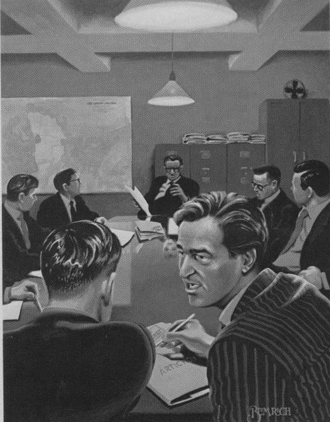
First Light can either be one of two things: 1. The big bang that brought you all to my blog, or 2. The first star a new telescope is trained upon. Either way, the metaphor is spot-on for what the production company is trying to do: Get young directors and writers funding to realize their digital movie making dreams.

Tom, Courtney (Bill and Steve), you light up my life.

Bakersfield Jazz Festival Poster


Boom. In your face.

For ever and ever and ever I have done posters for the Bakersfield Jazz Festival on and off and on and off and now on again. Mark Ramsey is the A.D. on the gig and enlists my help to get a poster together every couple of years.

This year, Mark wanted to see something with silhouettes and a big splash of color—something to compliment the atmosphere the springtime event puts out. Marrying up the illustration with some expressive type, the poster is a departure from the past post-these-bills we've knocked out before.

2.11.2008

Yes we do.


Marlin Rocks.

The best projects are the ones where you can do whatever you’d like. The best-of-the-best projects are when you do something you’d like to do for yourself. Marlin Rocks is just such a project.

Marlin was visited by some folks from “they-who-must-not-be-mentioned” and to say thanks for taking a look at us, we put together two iPods with music selections from some of the crew.

But what made it real cool was a video introduction of the songs which Judith Garson and my man Quentin Brown put together. They went around and had folks present their pick for the playlist. We set the iPods to play the movie first thing when the recipients turned it on.

Would anybody like to send me an iPod?

2.04.2008

Real Smooth


Getting smooth to work for you.

Seattle’s Best Coffee (SBC) is a well-known brand that’s owned by a much better known brand, Starbucks.

The SBC folks had a SYSCO trade show to attend and needed a simple handout to create a little (yep, I’m gonna say it) buzz.

Smooth is the name of game with SBC so, working with copywriter Chris Rock and AE, Ashley Earwood, we developed the above piece with the head, “Smooth works for you.” The message was directed at SYSCO reps, delivering what they’re looking for; something that sells itself.

The mechanics of the piece were a literal play on the headline; the lid pops off and reveals the message.

Real smooth.

2.01.2008

Let’s Go Bowling


Downtown Quentin Bowlin’ Brown.

At Marlin, we don’t just drink Starbucks coffee, we make it look good to drink Starbucks coffee.

We do tons of work for Starbucks Foodservice. They’re the folks who get Starbucks into places that Starbucks retail hasn’t penetrated (unbelievable, I know). Every year the FS people have a national sales meeting and for FY08 they all got together one evening for billiards and bowling at Garage in Seattle, Washington.

We presented several options (mostly gutter balls), but the beauty above was the spectacular splasher that got the game to a cool 300. Head kegler, Matt Rose, did a quick sketch of a mug as a pin (which forced me to cough up a beer frame—I’ll getch’ ya next time, Rose) leaving me to pick up the spare by tackin' down the stars as goal posts and nailin’ a barmaid down the back ends to the kickback with slick type and touch of good old fashioned distress to get ’er in there. But hey! We were sandbaggin’ just to get ’em to pickup the next beer frame.

As the legendary Chick Hearn once crowed, “Bowling for dollars, where the money goes up, as the pins fall down.”

Soccer Clubbing


Young Ben owns the soccer pitch.

My youngest son, Ben (Bubba), is an anomaly. I have done fairly well in sports, but I always had to work at it. Ben on the other hand is a natural. He plays on two soccer teams, one through the YMCA and the second is a competitive club team under the monicker of Magic Soccer.

Both teams have been without a proper logo, with the Y team using the provided t-shirts and the Magic Soccer team sporting cheap uniforms from South America. So it was time to get them branded properly.

The Cones, coached by Ben’s uncle Jon Timson, was named by Ben’s cousin George due to the brilliant orange of the Y shirts they wore during their undefeated season.

Magic Soccer is coached by Jonathan Marquez who is a fantastic, supportive leader for the U11 boys. Growing up between Missouri, San Diego and Venezuela, Jonathan’s coaching style has created an unstoppable force to be reckoned with.

We are Magic!

1.31.2008

Hot Hot HOT Cocoa


Oh how I miss Critch. No, not that critch.

You see, Gale Venosdel (or Critch, aka Lawrence, to me) was an art director here at Marlin. He’s now gone back home to roost in Tulsa and keeping his family fed via Littlefield.

He, Chris Rock, account exec Dan Schultz and I worked on a direct mail promotion for Starbucks hot cocoa. Gale did almost all the work on this one. He got me involved to tighten up the typography and illustrations.

Believe it!

Tin Man


Coffee cake is great. But Sandy’s Sour Cream Coffee Cake (SSCCC) is an out-of-body experience.

In an effort to express the uniqueness of SSCCC Sweet Street wanted to offer the snack in a tin through their cybernet store.

I utilized off-the-shelf SSD assets and invented a few new ones to create a brand dress that felt Sweet Street but uniquely its own.

We shipped off the concepts to the big heads in Reading, PA only to have the whole project evaporate into the misty mountains of the Ozarks.

Oh well.

1.30.2008

Marlin Stationary


With the parting of the ways of Marlin and Deep, a new identity for the new millennium was called for…


The Marlin Company has been around for nearly 25 years and have had several logos along the way. With this iteration, through our long history and niché recognition, we were confident enough to hone the brand from ‘The Marlin Company’ to ‘Marlin’. We also shortened the horizontal footprint by creating a ligature between the ‘i’ and ‘n’ and mirroring the dot of the eye to make (every copywriters worst nightmare) a banger. The logo reads as Marlin, though if you were to study it, the ligature might become tiresome. But a great mark ought to be seen, not read.

The stationary was printed on the Curious Collection’s Curious Metallics. We had each item’s reverse flooded with one of four Pantone solids. The business cards had the four colors alternating so that all employees received a deck with four different variations of their calling card.

Oh, and about that banger I mentioned above, stick it Rock! And you too Garson!

1.29.2008

Booth Bear Label


Booth Ranches, a citrus grower in Orange Cove, California, was founded by the great-grandson of Times Mirror founder Harrison Gray Otis’s namesake, Otis Booth

Ranked number 181 by The Forbes 400, Mr. Booth leaves the day-to-day operations to his daughter Loren. She stumbled into my studio on a referral by interior designer Napier Hill, where we began working to develop the Booth brand.

The Otis Orchards label uses a variation of the iconic California Grizzly Bear from the state’s flag standing sentinel over the fruit of their labor. The bold graphic was designed to pay homage to the Booth family’s long history with Los Angeles and the Golden State.

Cheat


The Art of Pastry Chefdom.

Our heroes, Sweet Street Desserts, provide the nation’s leading restaurant chains delectable desserts that make a pastry chef question their very existence.

The SSD team here at Marlin is always thinking about ways to position the Reading, Pennsylvania confectioner within the minds of operators and ultimately consumers.

Marlin’s president, Michael Stelzer, and senior copywriter, Judith Garson came up with the idea of a cheat sheet for pastry chefs. The solution was simple yet impactful: Create a bible-like book that operators could use as a ‘cheat‘ to offer diners gourmet desserts without the expense of an on-site pastry chef.

My design application used a bible-like format with a calligraphic ‘Cheat‘ imprinted upon a vellum flysheet and overlaying a beautiful plated dessert with the cover typography and ornamentation crafted to the tone of an old tome.

Amen.

1.28.2008

Catalyst


Agencies have war rooms. We have a Cat Room, or CAT.RM.

Cat, short for catalyst, is how we summarize our approach to creative problem solving. A catalyst is something which accelerates a reaction. That’s what we attempt to do at Marlin.

This mark has two drops coming together to form the ears and face of a feline.

Me-Yeeooow!

Marlin Employee Handbook


It's time to throw some new stuff up.

When I started at Marlin I was handed a little black vinyl three ring binder outlining the company’s mission, vision, structure, rules, etc. It was OK, but it didn’t remotely capture the soul of the comapny and the dynamic personalities that make it up.

For the quad-annual company meeting held at the Missouri Sports Hall of Fame, we decided to revamp the employee handbook and formalize the relationships between the four companies under the Marlin Network umbrella. It covers all four companies, Marlin, Deep, iMarlin, and Food IQ.

The image above represents the marks of the four agencies that make up the Marlin Network, and the design of the book is the tone that will become the Marlin Network’s website currently under development.